
We’re often told that the secret to success is to do one thing and do it well. But Dutch illustrator Merijn Hos has defined his own version of success. To curb his inexhaustible curiosity and fuel his desire to constantly challenge himself, Merijn changes things up on the regular. Sometimes that even means turning away clients if it’s not the direction he wants to go in.
As early as his art academy days, Merijn has been choosing his own path. While hard to imagine now, he even refused to work with a computer during his studies. “I was kind of being recalcitrant. But things were a little different then, computers weren’t all they are today. We had these dodgy computers at school and I just wasn’t into them,” he says.
He turned his no-computer policy into a sport of sorts, but after graduation (“It took me six years, I was a terrible student,” he admits), the first thing he did was buy one. It’s not that he “gave in”; he just knew it was best.
In the same way, he studied illustration even though he was more into fine arts and painting; he figured it’d be hard to make a living as an artist. “Now, my work straddles the boundaries of art and design. A lot of the elements I use in design or illustration are ideas I’ve generated in my freer, personal work.”
Over the years, his style has progressed quite organically. He admits that it has been the result of getting bored easily and wanting to experiment with new ideas. About ten years ago for example, he decided to stop drawing his playful, colorful characters which clients often commissioned him for all together. “I didn’t want to forever be known as the guy who made colorful characters,” he says. It was a radical decision and he spent the next year experimenting to find a new visual language.
All the while he has racked up clients like Bose, Red Bull, Google, WIRED, The Guardian and Nike. Often brands approach him because they want to capture a certain vibe and so he’s left up to his own devices. “A lot of my commissioned work is inspired by my personal work, and I think that’s the reason why a lot of clients give me a lot of freedom.”

Before putting anything new on paper, he takes some time to consider the piece. “Once I’ve really had a good think about it, it doesn’t take me too long to create the more or less ‘final’ image. I never present something to a client unless it’s 80 to 90 per cent finished. It can be quite confronting for a client to be seeing the almost-final image, but I’d prefer to show them something that’s almost exactly how I want it to be.”
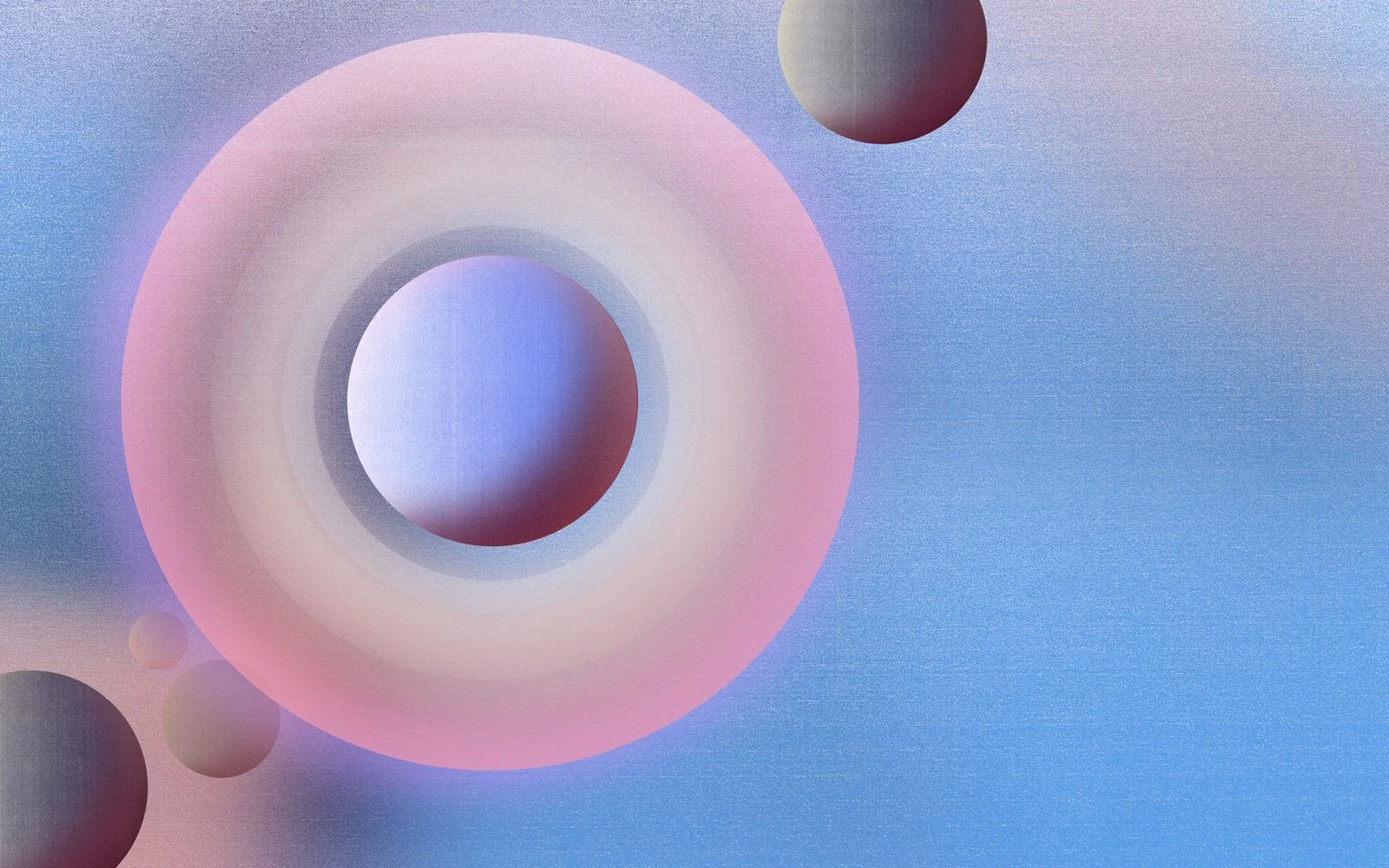
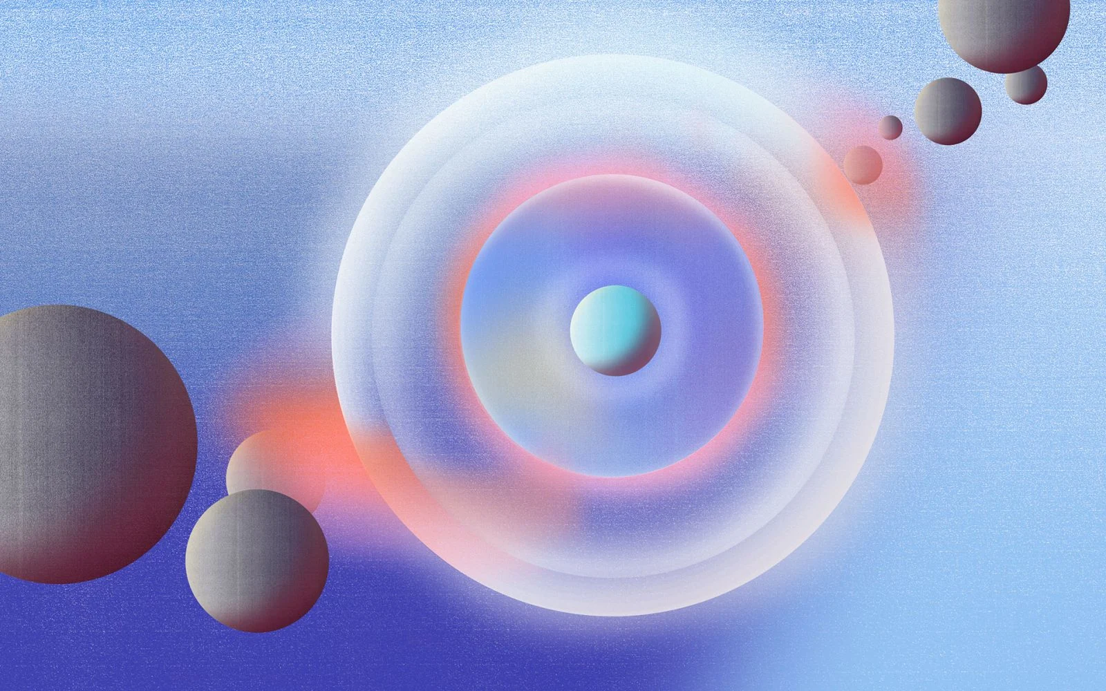
Despite the changes in styles and the variety of work he’s created over the past decade, there are certain common threads that make them recognisably Merijn Hos creations, like the “bubblegum color palette” he’s been working with since day one, and the recurring circles that he can’t seem to get rid of. “I worked as an art director for the Utrecht-based record label 030303 Records and challenged myself to incorporate circles in every sleeve artwork. I think it just stuck.”
His recent series Planets features, you guessed it, circular shapes in his signature, gradient style that resembles, “the airbrush paintings you see on attraction rides.” He laughs, “I think it’s funny, it’s super science fiction-y and I don’t even like science fiction films or anything related to fantasy. But there’s something about it, it’s kind of tacky and I like that you’re not quite sure what you’re looking at. I think it works.”
