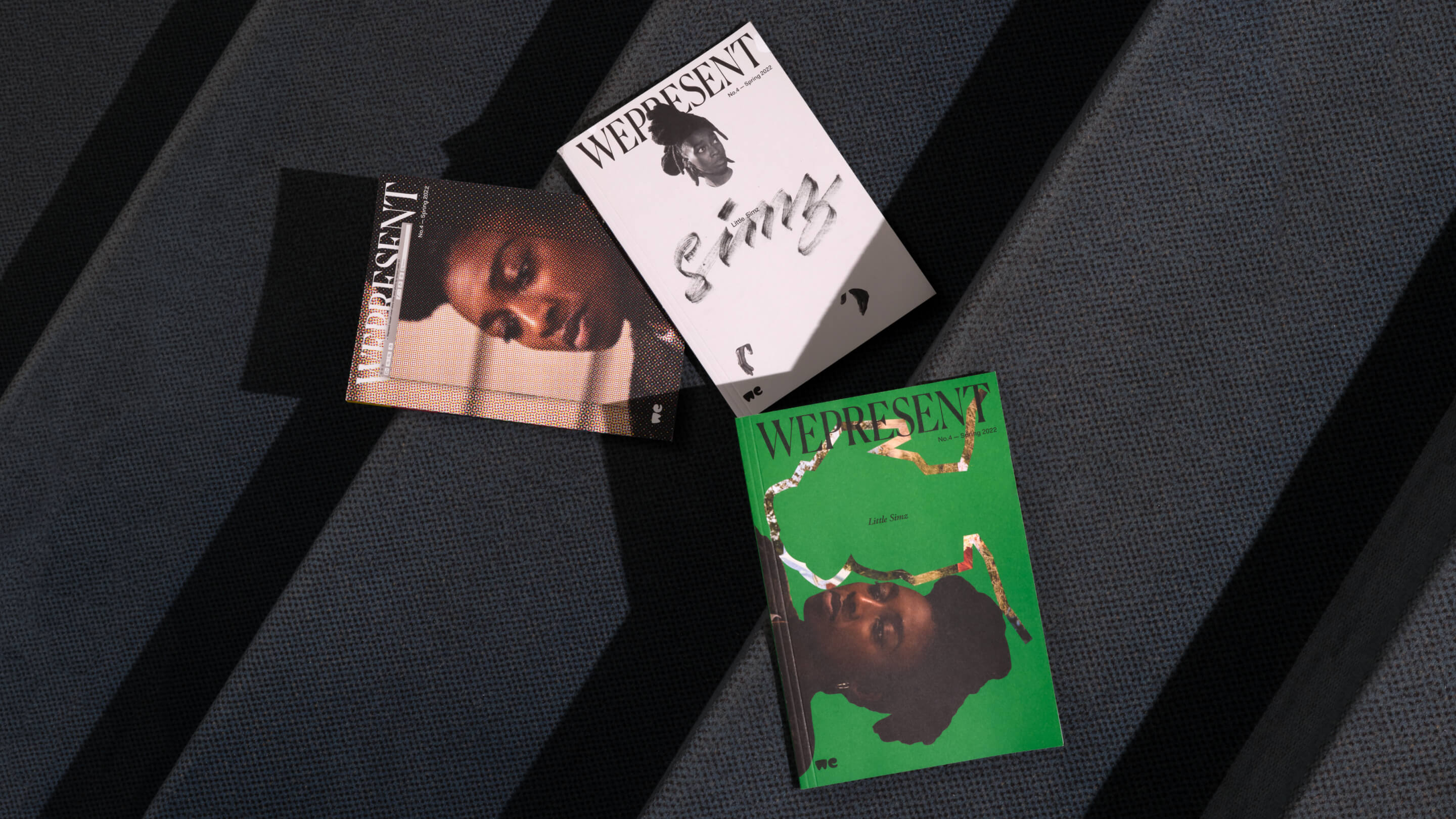
WePresent no.4 is more than a magazine, it’s three. It exists in multiple forms: three issues designed by three breakout talents from across the world. Chloe Scheffe, from Seattle, Nejc Prah, from Ljubljana, and Seri Tanaka, from Tokyo, designed their own versions of a print run split in three equal parts. Each totally different but also the same, the magazines explore the ways editorial design affects content.
The starting point were articles we published online. We revisited a select few, and recombined our collaborators in new ways—for example a conversation between Little Simz, who we worked with on her debut short film in 2021, and Caleb Azumah Nelson, who wrote a short story for our Literally series. Artists like Marianne Faithfull, Isamaya Ffrench, and Michaela Younge pop in across different stories, hanging out in printed form. The publication is a remix of what we do online, not only in content but in form. Or to use another musical metaphor, it’s like different cover versions of a song, where each interpretation reveals something about both the original and the new.
Interpretation is the key word here. From the off, we knew that we wanted the design to be born out of visual appropriation, translation, and even corruption. Inviting three different designers was our way of making this layer of interpretation visible, because personal choices become evident. It was fascinating to see how one designer decided to start the magazine with a certain article and stretch it to several spreads, whilst another one shortened that same story and put it towards the back. Where one sees playfulness, another introduces order.
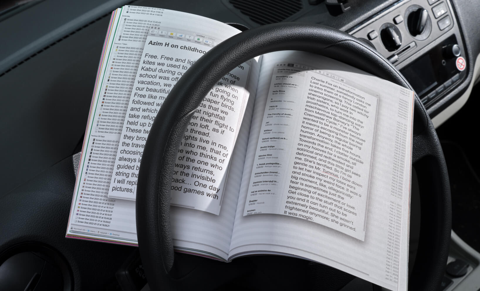
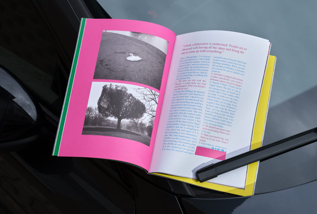
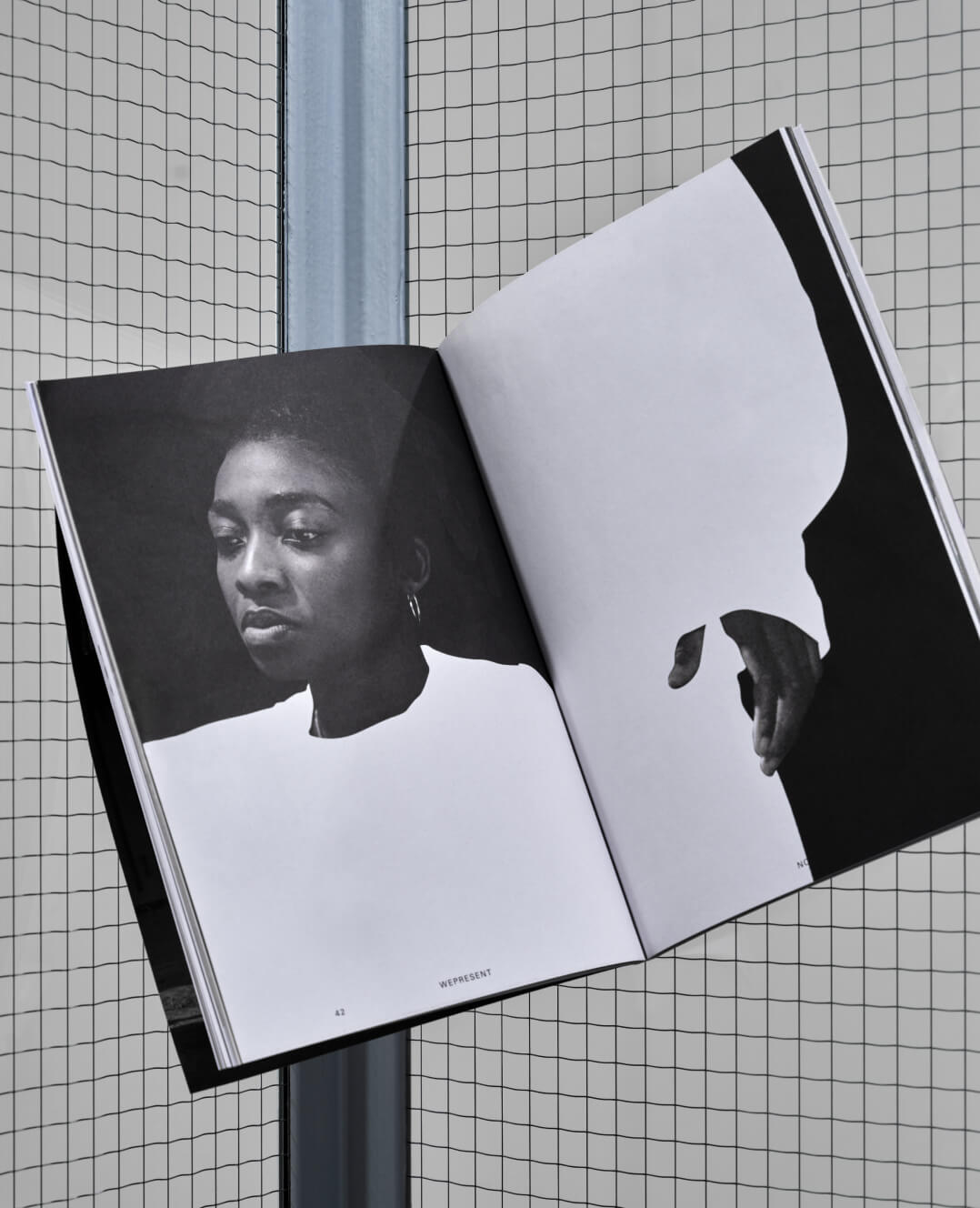
Chloe gave us a poetic subversion of classic editorial design with human, gestural expression, lending her magazine the air of a scrapbook, of thoughts in progress. Nejc built on his personal research in the vernacular, inspired by how design is manifested as utility. And on the other end of the spectrum, Seri gave us spreads that can be seen as posters, using the text to draw graphic shapes soaked in color. Individually, they are articulate visual essays. Together, they are a diverse, international portrait of contemporary design.
To explain why we’re so proud of this, I can't help but talk a bit of corporate speak. Every company has its values, the things it believes in. These can be as bland and soul-crushing as they come, but they can also be genuine attempts at making a positive contribution to the things we at WeTransfer collectively believe in. I work at WeTransfer to champion creativity, and through WePresent we try to walk the walk when it comes to empowering creators across the world. More than that, my personal experiences led me to value opportunity, internationalism, and representation. All of this is folded into the publication.
The magazine is, then, a platform for us to connect with design as a discipline and learn ways of collaborating with designers beyond the client/commissioner model. After all, when WePresent works with artists like Marina Abramovic, Ai Weiwei and FKA Twigs, we are their partners, not clients. We’re interested in what they have to say. It hasn’t been without challenges, and there were moments where we had to decide how we were going to respond to contributions that took us further out of our comfort zone than we were ready to go. I learned to value these moments a lot.
"...you can tell yourself that it’s open as much as you want, but inevitably you always do have something in mind. Being wrongfooted can be disconcerting, and it was, but it’s also an essential part of the project."
Nejc’s magazine is a good example of that. In pursuing his personal research, he created something that is far from the archetypical visual journal we had in mind. And here is the catch with an open brief: you can tell yourself that it’s open as much as you want, but inevitably you always do have something in mind. Being wrongfooted can be disconcerting, and it was, but it’s also an essential part of the project. Relinquishing control is something that takes learning, it doesn’t come naturally to an in-house creative team whose daily job is molding things into a coherent, consistent vision.
This is also where having three versions worked as a pressure valve. Because we were not working towards one single, absolute answer, it made it easier for us to accept risk. We know that to truly create range we need to explore the edges, not the center. I’m so glad we were challenged, and I’m delighted with what we created together.
Moving forward, we’re already keeping an eye out for designers to collaborate with on the next issue. There is no formula, but we’re after diversity of representation: not only of gender, background, and age, but different career stages, from all nationalities. Growing up in Brazil, I thought I had to go abroad to be noticed. So for me now, to engage with the international creative industry through the making of a magazine is both a privilege and a duty.
I couldn't wrap this up without addressing the underlying question running through our process: why even make a magazine? They’re not the most efficient way of distributing content and they consume significant resources. Once read, at best they're revisited from time to time as a source of inspiration and reference. Or they'll sit on a shelf until it’s time to move flats and a decision must be made: new home, charity shop, or trash.
Why, then, would a digital publishing platform like WePresent print a magazine? To simply say the same things we say online but on paper would be the wrong, and frankly unacceptable, answer. We did it because we wanted to say something else that could only be said in magazine form. Because we love and cherish artifacts and believe in the alchemy that happens when something is made physical.
Aware of the impact of such physicality though, we tried to tread as lightly on the planet as we could. The magazine is deliberately small, designed to optimize paper usage and reduce transport emissions. It was printed by Tuijtel in energy-efficient facilities with carbon offsetting, using cradle to cradle inks, recycled paper, only water based coating, environmentally friendly glue and no foils or chemical materials. These are small but important steps, so at least when moving day comes there is another option: composting.
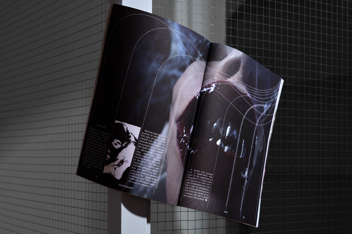
Photography by Lonneke van der Palen
Designers: Chloe Scheffe, Nejc Prah and Seri Tanaka