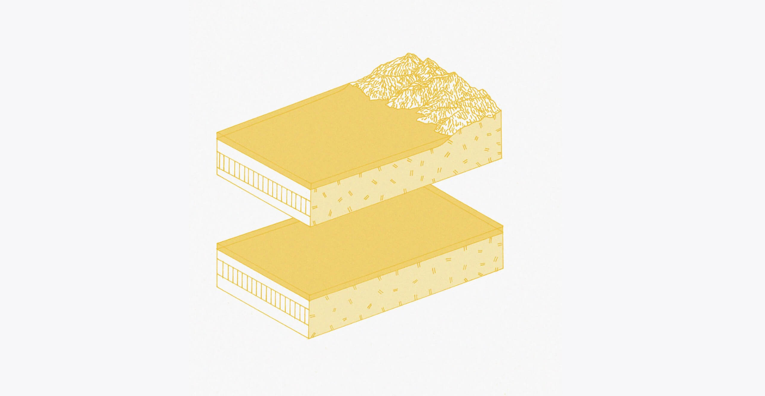
In the 1920s, the Austrian scientist and philosopher Otto Neurath developed a language, Isotype, completely made up of images. He believed that using imagery instead of words would help develop a universal language, one that would avoid the historical and culturally determined meaning of words, which are always open to interpretation.
Isotype is a system of images reduced to their very basics to include only the information that was important — think of the restroom signs used all over the world. According to Otto, it would communicate information understandable to anyone, wherever they’re from, whatever language they are speaking. His ideas have shaped the basics of modern design theory and data visualisations (you could even argue that his simplified images are an early form of emoji).
I’ve always been intrigued by this idea of communicating information through images, but I disagree with Otto that visuals can be universal, and closed to interpretation. Just like written text, images are never neutral. In fact, I think images have multiple layers of meaning to them, depending on what they’re referencing but also in what context they are used.
That’s why I see storytelling more as an interplay between words and visuals, one adding to the other and vice versa. This idea we take to our approach to commissioning illustrations for WeTransfer’s content site WePresent.
I see storytelling more as an interplay between words and visuals, one adding to the other and vice versa.
This year alone, we’ve commissioned 36 illustrators, from 14 different countries all over the world, from China to Colombia and from India to Belgium. 22 of them are female, making up about 60% of the commissions. Together they have worked on 100 (yes, believe it or not, it is really a round number) illustrations for WePresent.
In 2018, 15 million readers have already visited WePresent — discovering the works and stories we’ve featured and commissioned by brilliant artists.
But how then do we go about finding the right illustrator for a story? Well, that’s actually where we start; with the story. We always go back to the initial story we want to tell, and how an image can help elevate that message.
First, we decide on what type of mood we want to communicate with the piece, whether it’s up-beat, surprising, fun, serious or powerful. From that, we look for the style that could fit that mood, like does it need a realistic image, something abstract? Something raw, or polished? Watercolor or CGI?
We always go back to the initial story we want to tell, and how an image can help elevate that message.
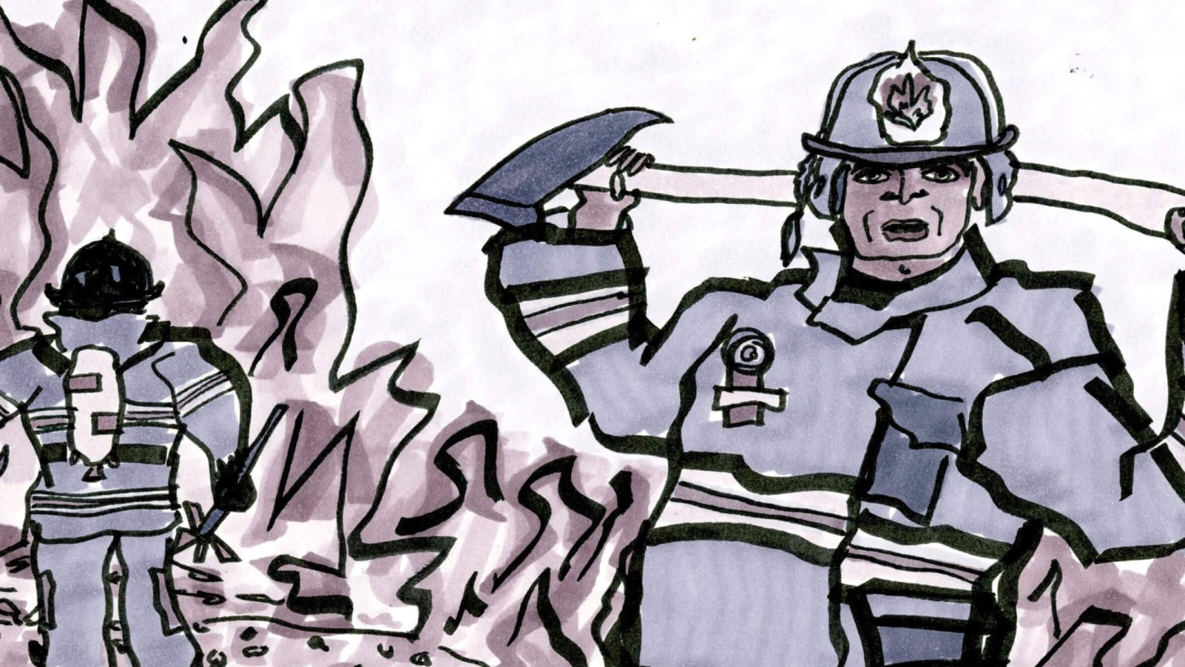
So for example, when I was looking for an artist to illustrate for our series Notes from the Underground, a set of interviews about how creatives bring about change in institutions, I started to look for someone with a grungy, punky counterculture vibe, as all the creatives interviewed go against the grain in one way or another. I landed on the New York-based illustrator Heather Loase, who has a brilliant raw style that fitted so well with the subject matter.
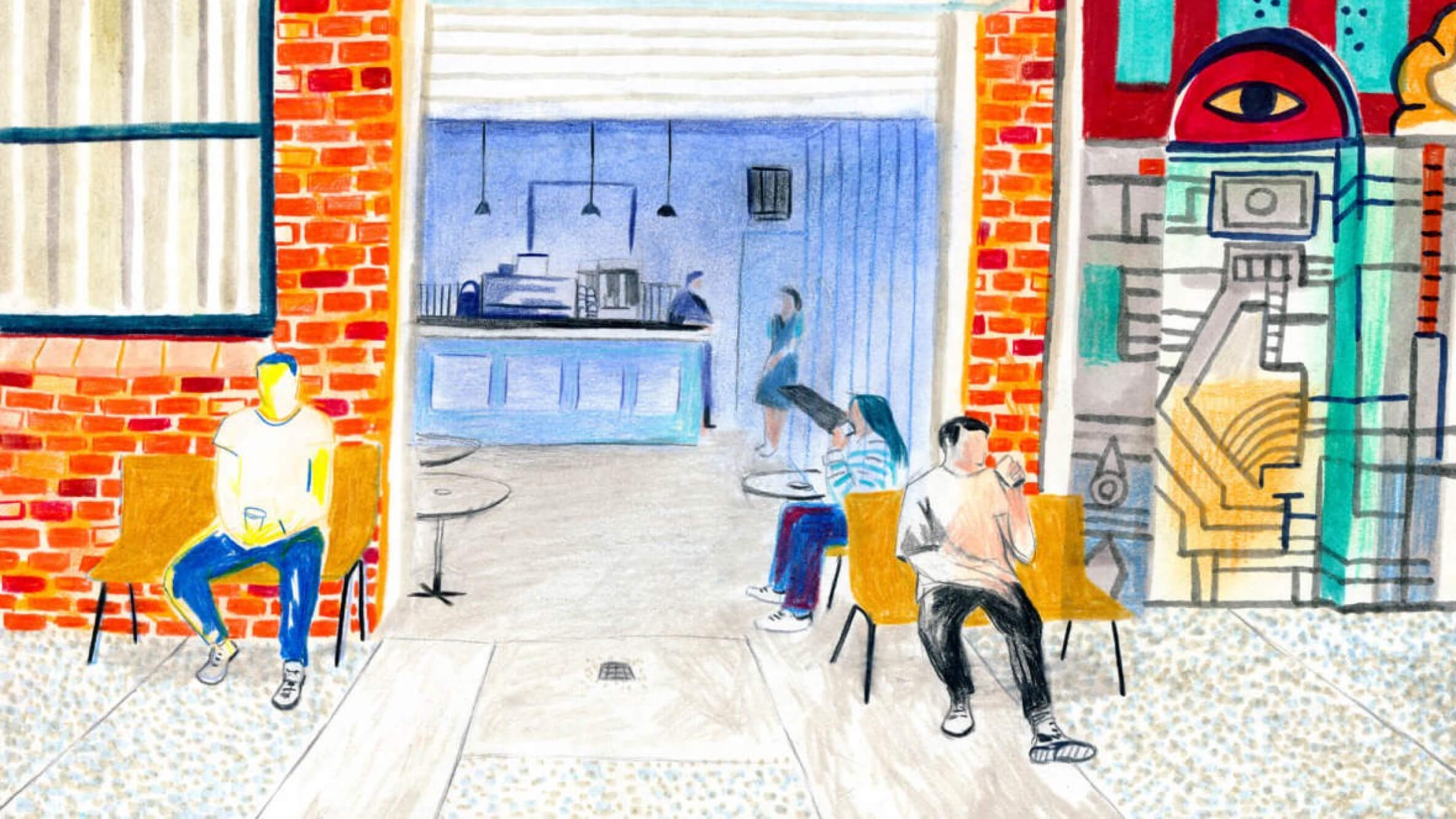
In contrast, for a story about Australian coffee culture, we worked with Spanish illustrator Pau Gasol Valls.
He’s got a lovely style, sketching the scenes he sees around him, using warm hues. His work really translates that feeling of going to your favorite coffee place in the morning and taking a sip of a fresh flat white (Australia’s pride), and it helped set the mood for this piece.
When commissioning for a story about Anthony Shore, a man who uses artificial intelligence to come up with names for companies and brands, I started thinking of digital artworks, even going to styles like glitch art or AI-generated art. Finally, I decided to work with Julian Glander, who uses computer-generated animations featuring fun, unidentifiable creatures, often adding elements like computers or screens to his works.
The result are super weird, and super fun little animations of someone living in a treehouse full of letters and some kind of slot machine spitting out words.
While we look for a specific style and mood to fit the stories, one of the key things that sets our storytelling apart is an unexpected element — like these above examples illustrate, we not only publish stories about creatives with a capital C, but outside of the artists, musicians and photographers we feature, we also speak to people who infuse their lives with creativity in a different, surprising way.
We aim to commission our visuals in a similar way, looking for people who can add that little extra to the stories, but that wouldn’t necessarily appear in another publication about the same topic.
We not only publish stories about creatives with a capital C, but outside of the artists, musicians and photographers we feature, we also speak to people who infuse their lives with creativity in a different, surprising way.
Take our recent series about creativity found in surprising places, in which we spoke to two teachers, an activist, and a tennis coach. Kamau Murray, the tennis coach, is known for successfully training the talented Sloane Stephens. Searching the internet, you will easily find interviews with Kamau about his practice, alongside with victory images of him and Sloane, posing proudly in front of the camera.
We decided to take a different route. Firstly we worked with writer Cedar Pasori on a story about his unusual coaching style (he, for example, draws on YouTube videos and sees the tennis court like a kaleidoscope), and secondly, we commissioned the talented Miranda Jill Millen to do the illustrations.
Miranda has a very interesting style. The people she draws don’t necessarily reflect our current beauty norms, with their long arms, weird hands and disproportionate faces. The universes she places these characters in are full of humor and story and it usually strips back things in a very postmodern way. With Miranda, we selected the most interesting scenes from the story, so naturally, the kaleidoscope tennis court and drawing on YouTube appeared.
Whereas linking Miranda to the story about Kamau had been easy, sometimes I do struggle to find the perfect visual for one of our pieces. For example, we’ve just published a story by Andreas Tzortzis about Jaimal Yogis, a surfer who has just written a book about the connection between sport and spirituality.
We soon decided on illustration — pictures of surfers and Budha didn’t sound that exciting to us — but then deciding on who and what they should illustrate was a challenge.
The article is really about Jaimal trying to move away from the stereotypical views people sometimes have of the surfing community, but also about how they themselves frown on spirituality too — we didn’t want to fall in the same trap of prejudices with our images.
I landed on a couple of figurative illustrators whose style would fit. But I kept getting back to that same problem; what would you have them illustrate that would just be stereotypical, with spiritual elements, the sea and the beach, and some surfers in the water?
That’s when I went back through my archive of Instagram-saved posts and saw Ella Webb’s imagery again. Ella’s work is abstract, super quiet and deals with natural elements (like the sea!) so it was perfect. Going for abstract works, like Ella’s really opened up the possibilities in how we could translate this story visually.
Another project, one of my favorites to date, really shows off the power illustration can have to communicate a message. The day before the March for our Lives in March 2018, we commissioned seven artists to make a protest poster with the brief “enough is enough.”
The result has been incredible, with contributions from Kate Moross, Edel Rodriguez, Eike König, Camila Rosa, Henning Wagenbreth, Brian Elstak and Ashley Lukashevsky (they all made them within 24 hours). One man from the US printed them all out and stuck them to his wheelchair when he went to the March. I love it when our projects can have a direct impact like this.
So although I don’t believe we could do without words (after all, I’m the editor of WePresent), I think there’s a very strong place for images to communicate important messages. They can set the mood, help explain or clarify, illustrate or heighten certain scenes and sometimes even help convince to do the right thing.
And yes, there are those images that can tell you something in and of themselves. Something about “a picture speaks a thousand words” maybe…