There is no one type of customer, especially among the millions of people who visit WeTransfer every day. So how do you know if your ad campaign, designed to attract customers, isn’t turning them away? Turns out, there is no one size fits all.
As a Certified B Corporation™, our desire to be a more responsible business informs everything we do. It’s why, as the advertising arm of WeTransfer, we keep our community of creators top of mind by designing ads that feel seamless and experiential, while aligning with brands that share our values.
For WeTransfer Advertising, this means producing high-impact campaigns that are diverse, inclusive, and accessible to everyone, no matter where they fall on the spectrum of ability.
For the majority, you’d never notice the difference: a button to pause motion, closed captions, or alternative text for screen readers. But for those who are hearing impaired, visually impaired or who have trouble using a laptop or device in the conventional sense, it defines the experience.
The notion of accessibility is multifaceted—and we’re all fallible to our unconscious biases.
WeTransfer Advertising reaches millions every day, everywhere, when they’re feeling most inspired, so it’s our responsibility to uphold that experience with meaningful creative. How can we ensure our ads leave a good impression? How do we delight audiences and create connections between customers and companies with ads that anyone, regardless of ability, can enjoy?
We think it begins with challenging assumptions. And as creative professionals, we make many (when we make a “clean” ad, we think it’s what “everybody” likes). What we tend to forget is this: The notion of accessibility is multifaceted—and we’re all fallible to our unconscious biases.
Below, we’d like to take you through some of the work we’ve released which features key accessibility components, as we strive to make the experience on our platform more thoughtful and accessible to everyone.
Snap Who
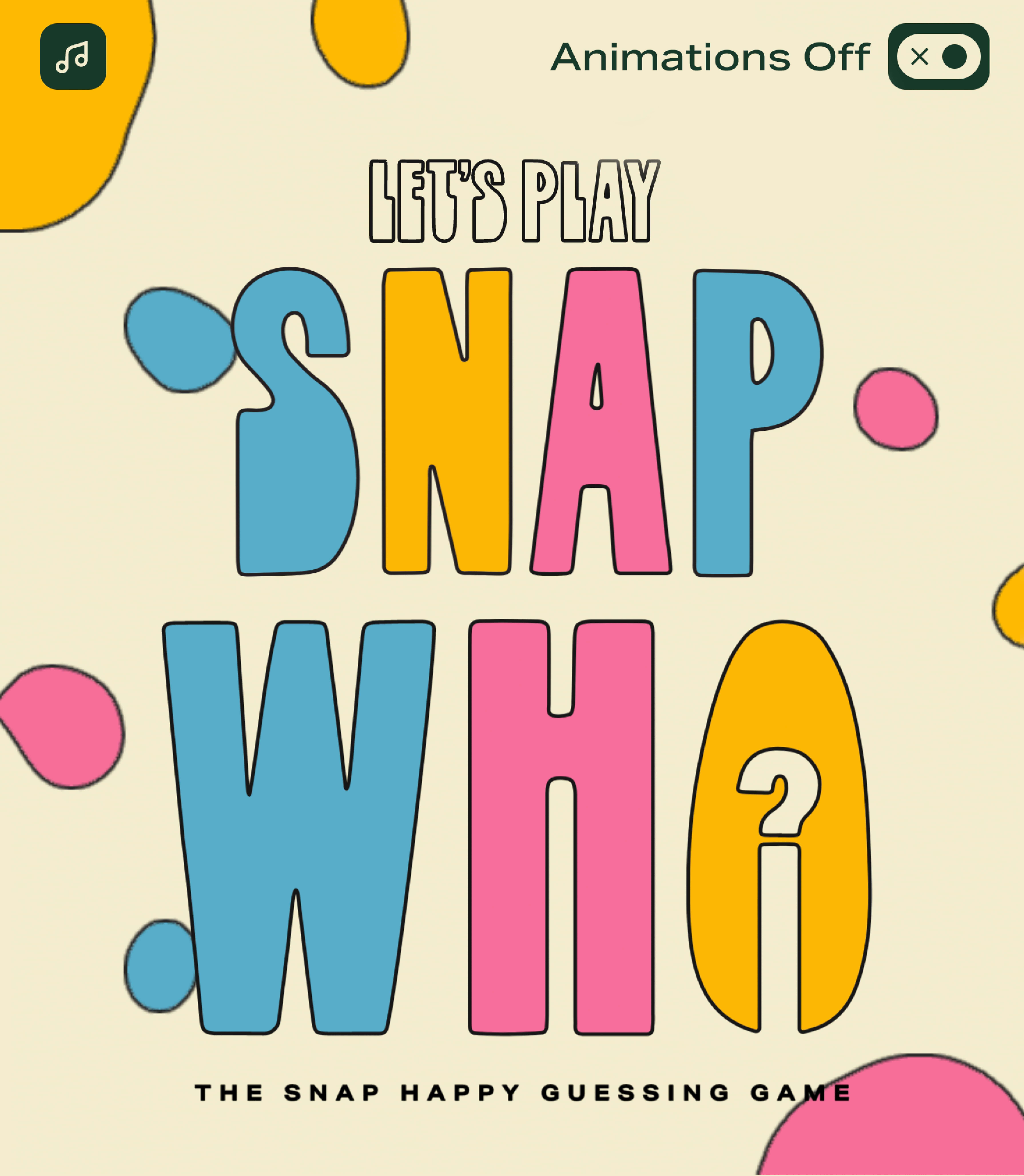
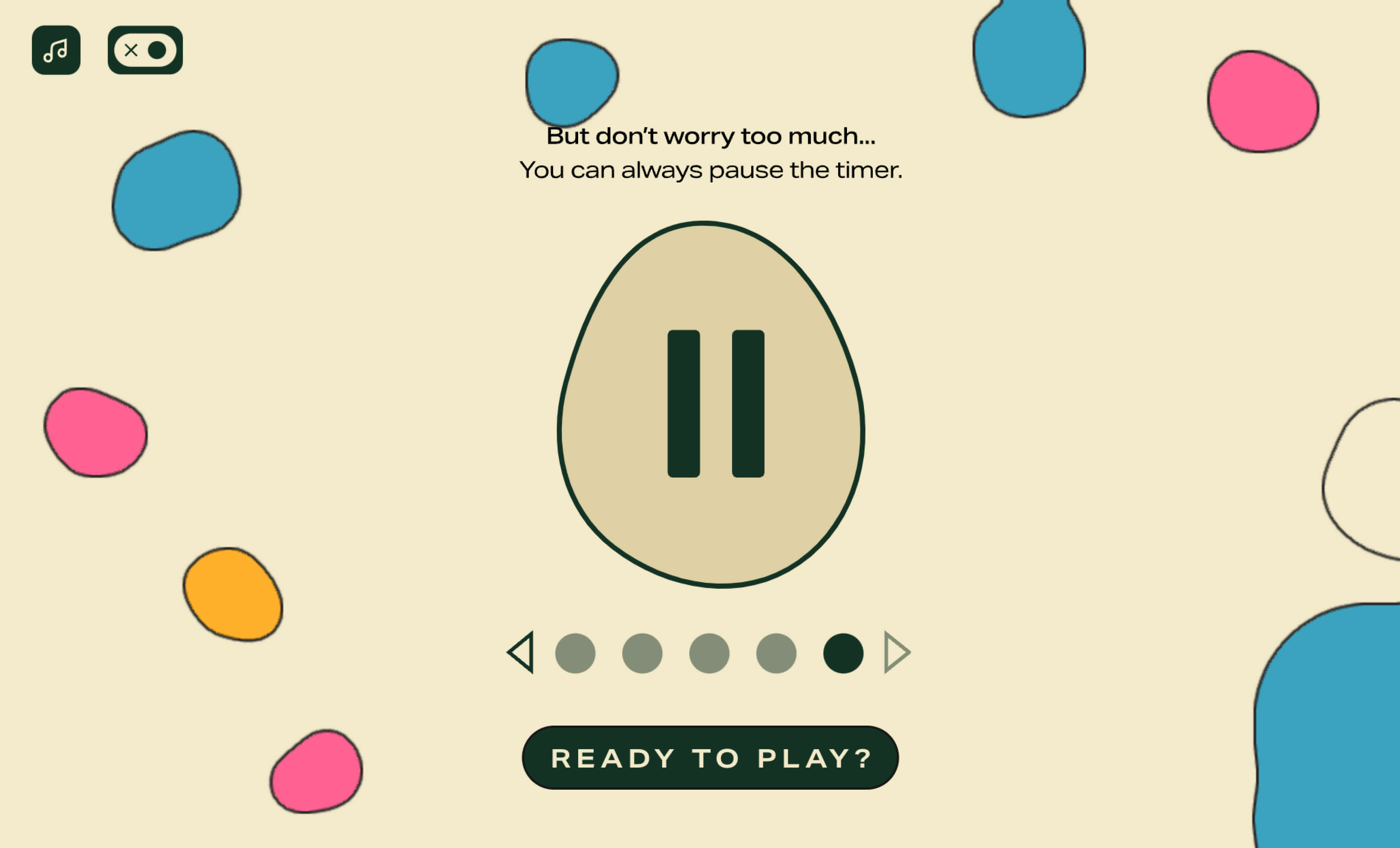
Our recent mind-expanding experience, designed to challenge perceptions, was a project where we considered accessibility throughout production—both at design and build stage. Besides giving users the opportunity to turn off animations and sound, many elements were updated to ensure the experience was as accessible as possible, such as testing the contrast of the text, ensuring everything was keyboard-operable, and adding text alternatives for all images.
Burberry
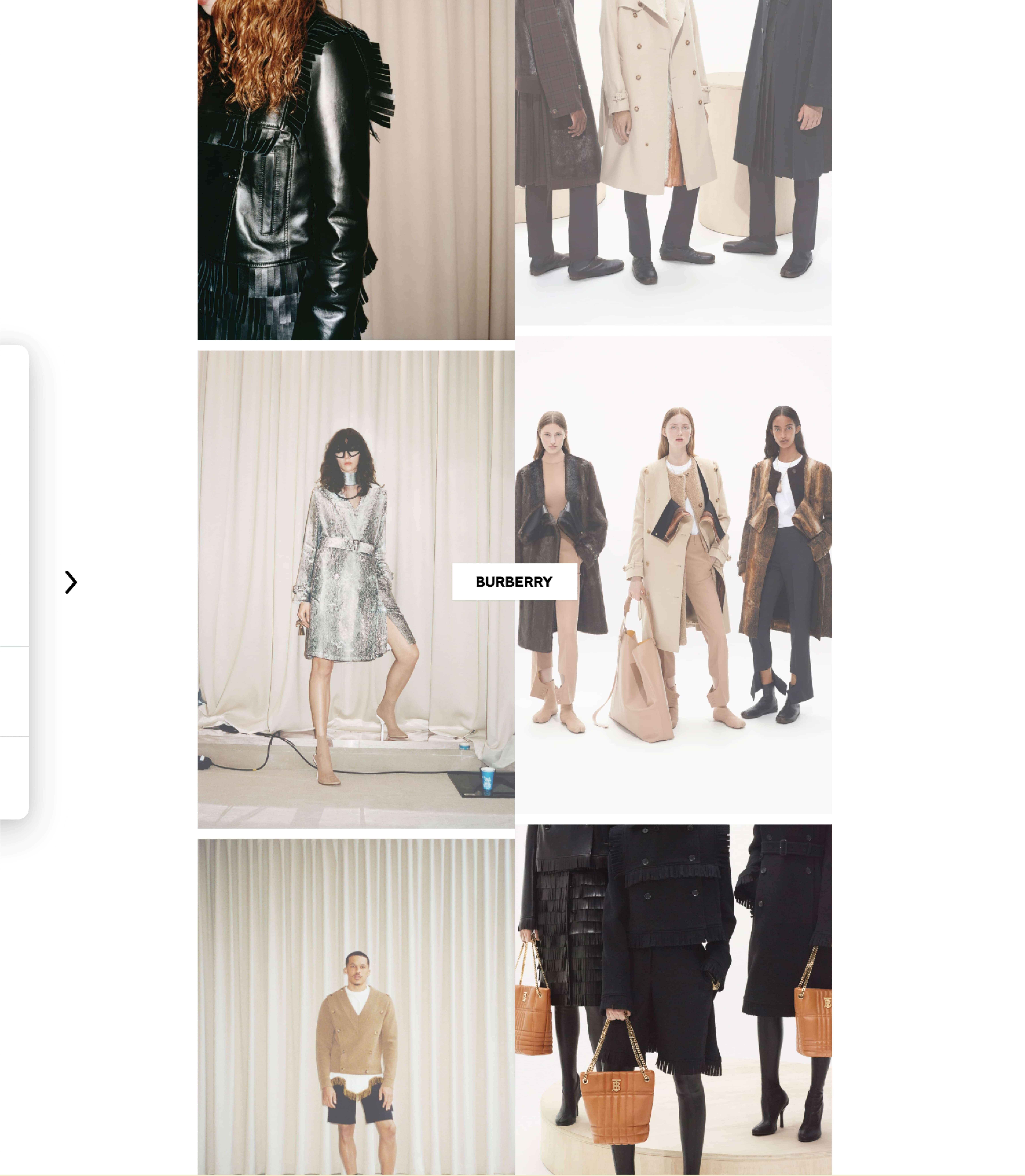
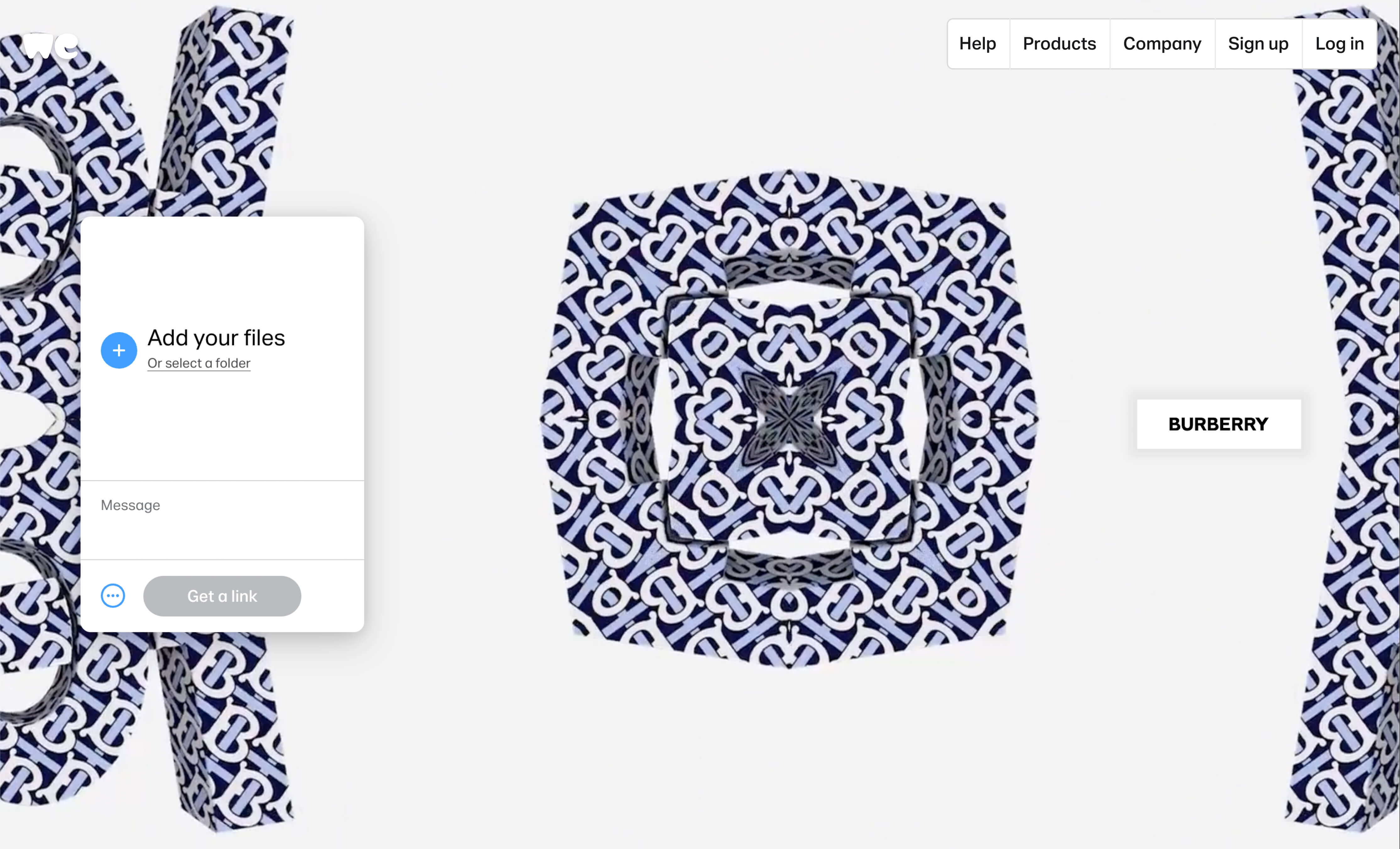
Accessibility was emphasized across these two campaigns for the renowned luxury fashion house.
You can notice here that the kaleidoscope animation is only triggered once the user interacts with the central logo, and that the motion speed changes based on how close the cursor is to the center. We can also note the design details: there’s enough negative space even when the kaleidoscope is fully playing, as we are generally mindful about how much space the content should cover.
On the other hand, this campaign is interesting in the way it is accessible to keyboard-only users, who are able to explore the experience solely by using their arrow keys. The reduced scrolling motion is worthy of note too.
Nationale-Nederlanden
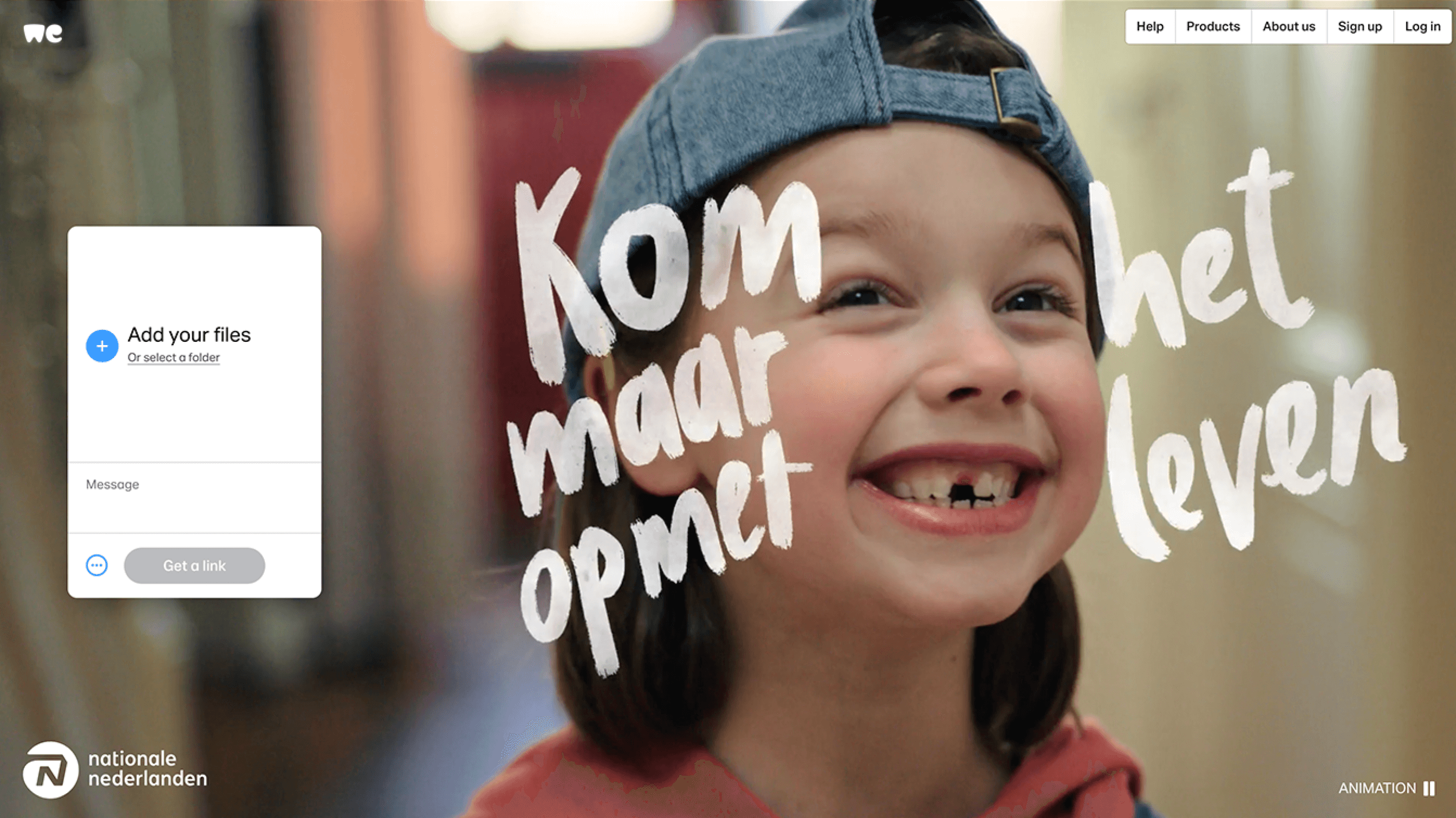
Sometimes, it’s all in the details: this ad for Nationale-Nederlanden—one of the largest insurance companies in the Netherlands—includes minor yet significant accessibility features, such as the ability to pause the animation and an improved cursor replacement.
There’s Nothing Comic About Dyslexia
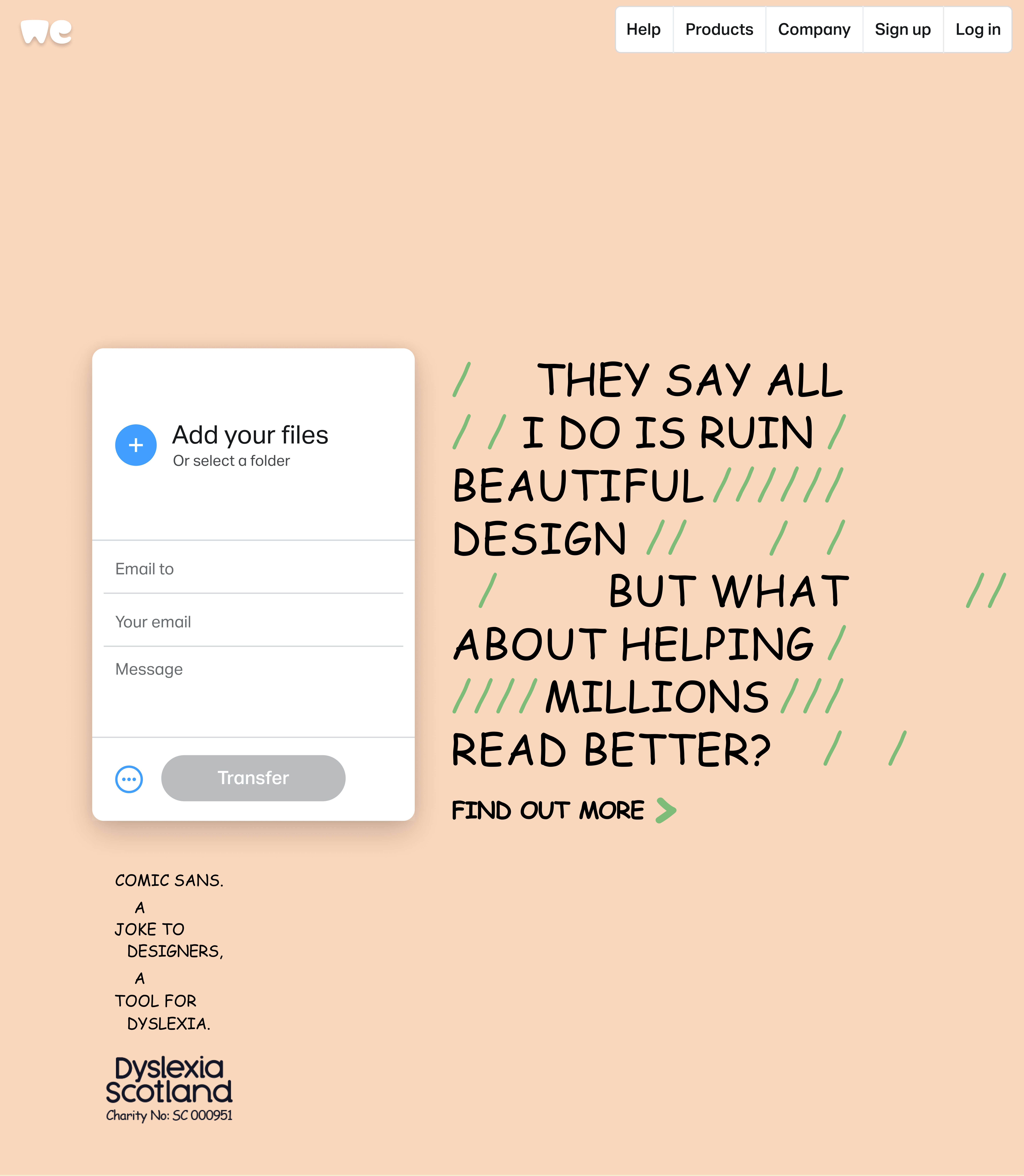
Finally, as part of our long-standing commitment to give away 30% of our ad inventory to causes that matter, we’re very proud of our collaboration with Dyslexia Scotland and Innocean Berlin. In the context of Dyslexia Awareness Month, the campaign urges designers to have a more inclusive mindset and raises awareness about how the much-mocked Comic Sans font has actually been found to help dyslexic people with their reading.
As the saying goes, there’s always room for improvement. In terms of the creative experience on our platform, it’s about acknowledging and anticipating the myriad potential needs of people who come across WeTransfer Advertising.
If you think of it in this way—as we do— then accessibility isn’t just the right thing to do. It’s simply good business.

What WeTransfer Advertising stands for
We do advertising differently and believe that creativity doesn’t have to come at the expense of integrity. Learn more about our approach in the latest WeTransfer Responsible Business Report with a dedicated section to our advertising business.
